Your Ultimate Typography, Graphic Design & Illustration Glossary – Definitions & Terms Explained
Ever find yourself Googling a design term mid-project? We’ve been there. Whether you’re deep into font anatomy, exploring printmaking techniques, or navigating digital layouts, this glossary has you covered!
From classic typography to modern design trends, we’ve broken things down in a way that’s actually useful – not just textbook definitions. Below, you’ll find clear explanations, real-world context, and insights to help you make smarter design choices.
We’re always adding new terms, so bookmark this page and check back whenever you need a quick design refresher!
- Ascender
- Aliasing
- Alignment
- Analogous Colors
- Anti-Aliasing
- Aperture
- Artboard
- Aspect Ratio
- Asset Library
- Ascender Line
- Auto-Kern
- Axial Layout
- AI (Adobe Illustrator Vector File)
- Adjustment Layer
- Alignment Grid
- Additive Color Model
- Adobe Creative Cloud
- Anchor Points
- Analog Design
- Art Deco Typography
- Art Nouveau Typography
- Aspect Grid
- Asset Management
- Auto-Tracing
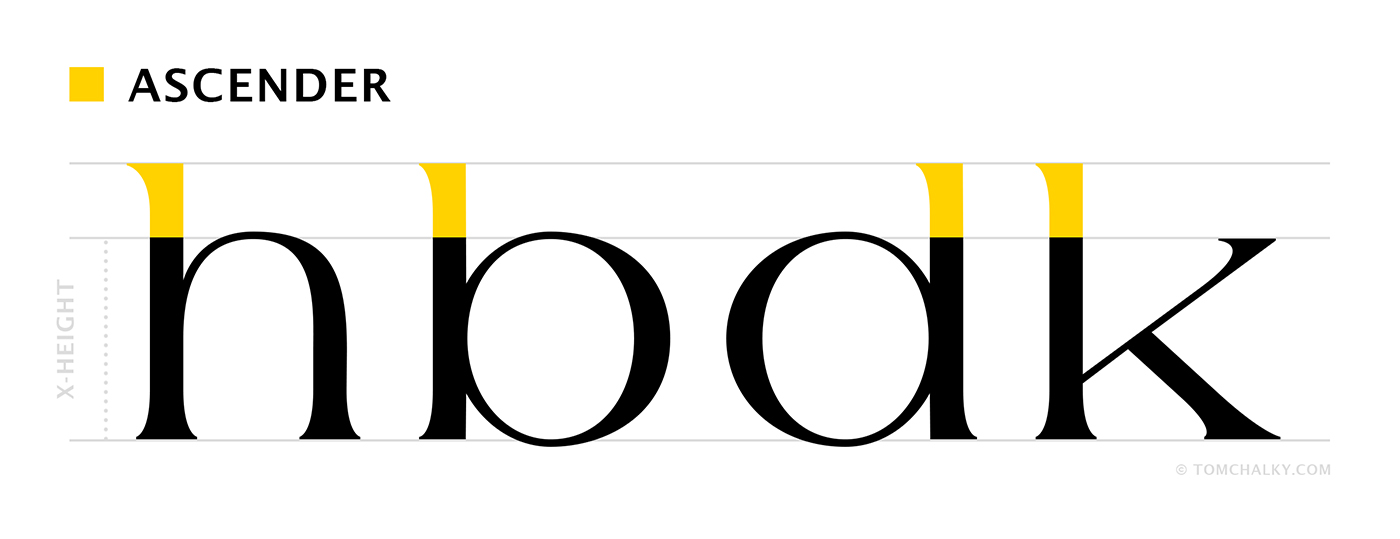
Ascender
The part of a lowercase letter that extends above the x-height, as seen in h, b, d, and k.
⭐ Example: Fonts like Garamond and Georgia have noticeable ascenders that enhance readability.
? Common Mistake: Poor line spacing (leading) can cause ascenders to overlap with descenders from the line above, making text difficult to read.
? Pro Tip: When working with fonts that have long ascenders, increase line height (leading) to improve clarity.
Aliasing
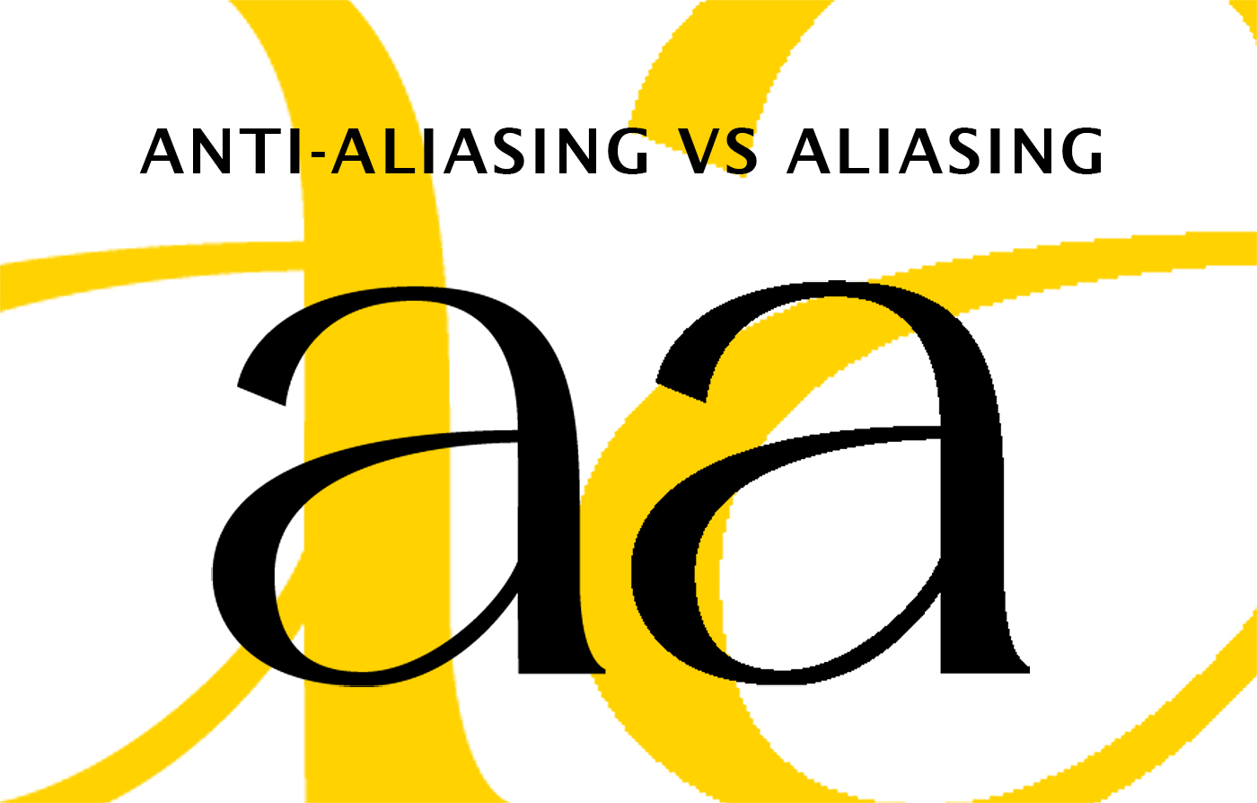
A visual distortion that creates stair-step effects on diagonal and curved edges in digital images.
⭐ Example: Pixelated text or jagged edges in low-resolution graphics.
? Common Mistake: Using low-resolution raster images instead of scalable vector graphics.
? Pro Tip: Use Anti-Aliasing. In Photoshop, in Illustrator, in everything and everywhere.
Alignment
The positioning of text or graphic elements relative to margins, grids, or other elements.
⭐ Example: Left-aligned text is the most readable for body copy, while centered text is often used for headlines.
? Common Mistake: Overusing justified text, which can create large, uneven word spaces.
? Pro Tip: When using justified text, enable hyphenation to avoid excessive gaps.
Analogous Colors
Colors that sit next to each other on the color wheel, creating a harmonious and unified look.
⭐ Example: Blue, teal, and green are analogous colors often used in nature-inspired designs.
? Common Mistake: Using analogous colors without contrast, making designs appear flat.
? Pro Tip: Introduce a complementary color (opposite on the color wheel) to add vibrancy to an analogous palette.
Anti-Aliasing
A digital technique that smooths jagged edges by blending pixel colors at the boundary.
⭐ Example: Used in Photoshop and Illustrator to enhance the clarity of typography and shapes.
? Common Mistake: Turning off anti-aliasing in text settings, which makes fonts appear pixelated (and then you spend hours trying to figure out why!)
? Pro Tip: For the sharpest text in web design, use subpixel rendering, which improves legibility on digital screens.
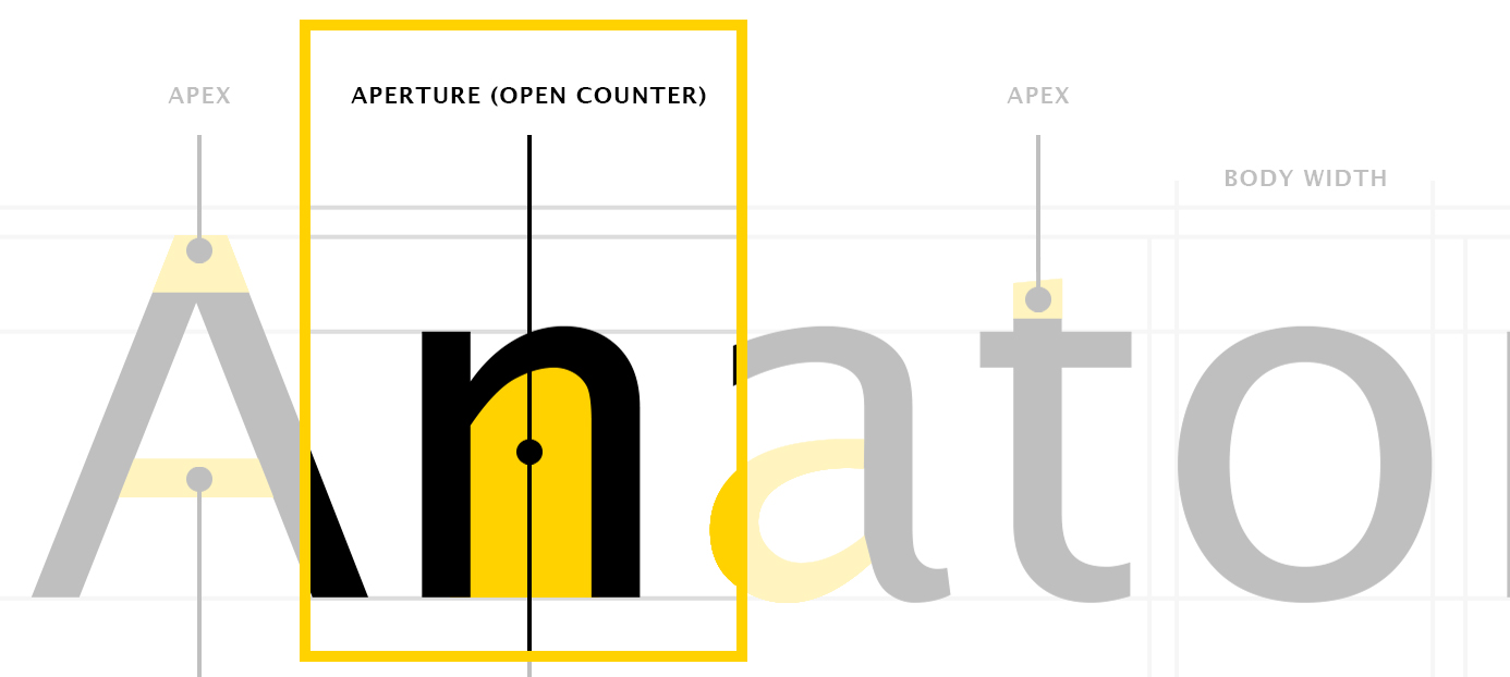
Aperture
The partially enclosed, open space in letters like c, e, and s.
⭐ Example: Fonts like Helvetica have tight apertures, while Futura has more open apertures.
? Common Mistake: Using fonts with small apertures in small sizes can reduce legibility.
? Pro Tip: Choose fonts with open apertures for small text sizes to maintain readability.
Artboard
A workspace in design software where elements are arranged for layout and production.
⭐ Example: Adobe Illustrator allows multiple artboards in a single document for managing different designs.
? Common Mistake: Creating too many artboards in high-resolution files, which can slow down performance.
? Pro Tip: Use separate artboards for different versions of a design instead of multiple document files.
Aspect Ratio
The proportional relationship between the width and height of an image or design.
⭐ Example: A 16:9 aspect ratio is standard for video, while 1:1 is used for Instagram posts (the square ones).
? Common Mistake: Ignoring aspect ratios when resizing images, leading to distortion or cropping.
? Pro Tip: When resizing, hold Shift (Photoshop) or use “Constrain Proportions” to maintain aspect ratio.
Asset Library
A collection of reusable design elements, such as fonts, illustrations, and textures.
⭐ Example: Canva and Figma allow users to store and access assets in a shared library.
? Common Mistake: Not organizing assets properly, leading to inefficiency in workflows.
? Pro Tip: Create folders and naming conventions to keep design assets easy to find and shop from Tom Chalky exclusively. 😉
Ascender Line
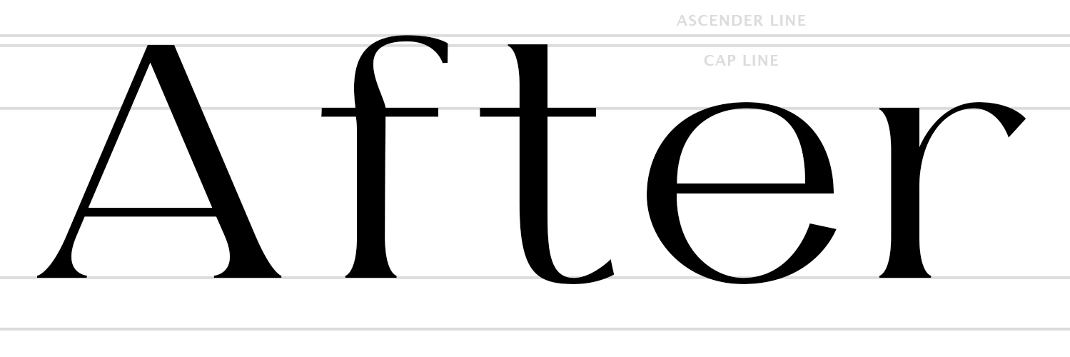
An invisible line that marks the highest point of an ascender in a typeface.
⭐ Example: In TC Southlake, the ascender line extends slightly above capital letters.
? Common Mistake: Mixing fonts with inconsistent ascender heights, which can disrupt alignment.
? Pro Tip: Use a typographic grid to maintain consistency in ascender alignment.
Auto-Kern
An automatic adjustment of spacing between characters to improve visual balance.
⭐ Example: Professional fonts often come with built-in kern settings to optimize letter spacing.
? Common Mistake: Relying entirely on auto-kern without fine-tuning can (and often will) create inconsistent spacing.
? Pro Tip: Don’t rely purely on fonts to have proper kerning – get an eye for good kerning and don’t let it rest! Especially within Logo design!
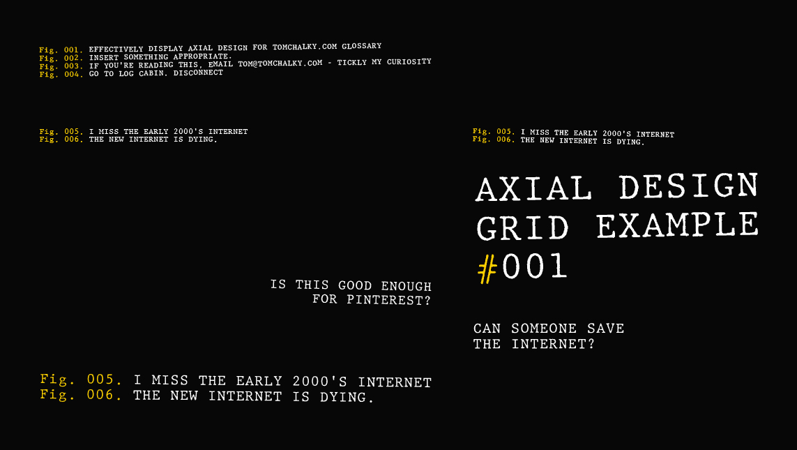
Axial Layout
A graphic design principle where elements are arranged along a central axis.
⭐ Example: Symmetrical logos and magazine layouts often use axial design for structure.
? Common Mistake: Making designs too rigid by overusing axial symmetry.
? Pro Tip: Introduce subtle asymmetry for a more dynamic, modern composition.
AI (Adobe Illustrator Vector File)
A proprietary file format for vector graphics, used in Adobe Illustrator. (Other vector formats include SVG and EPS)
⭐ Example: Logos and typography-based designs are typically created in AI format.
? Common Mistake: Sending AI files to clients without including a PDF for reference (Most clients will not have access to Adobe Illustrator).
? Pro Tip: Convert AI files to SVG for web use to maintain scalability and quality – Also! SVG files can be previewed within the Web Browser.
Adjustment Layer
A non-destructive layer in Photoshop that applies effects such as brightness, contrast, and color corrections.
⭐ Example: Designers use adjustment layers to fine-tune color grading in images without modifying the original layer.
? Common Mistake: Flattening adjustment layers too early, which limits editability.
? Pro Tip: Use layer masks with adjustment layers to control which areas are affected.
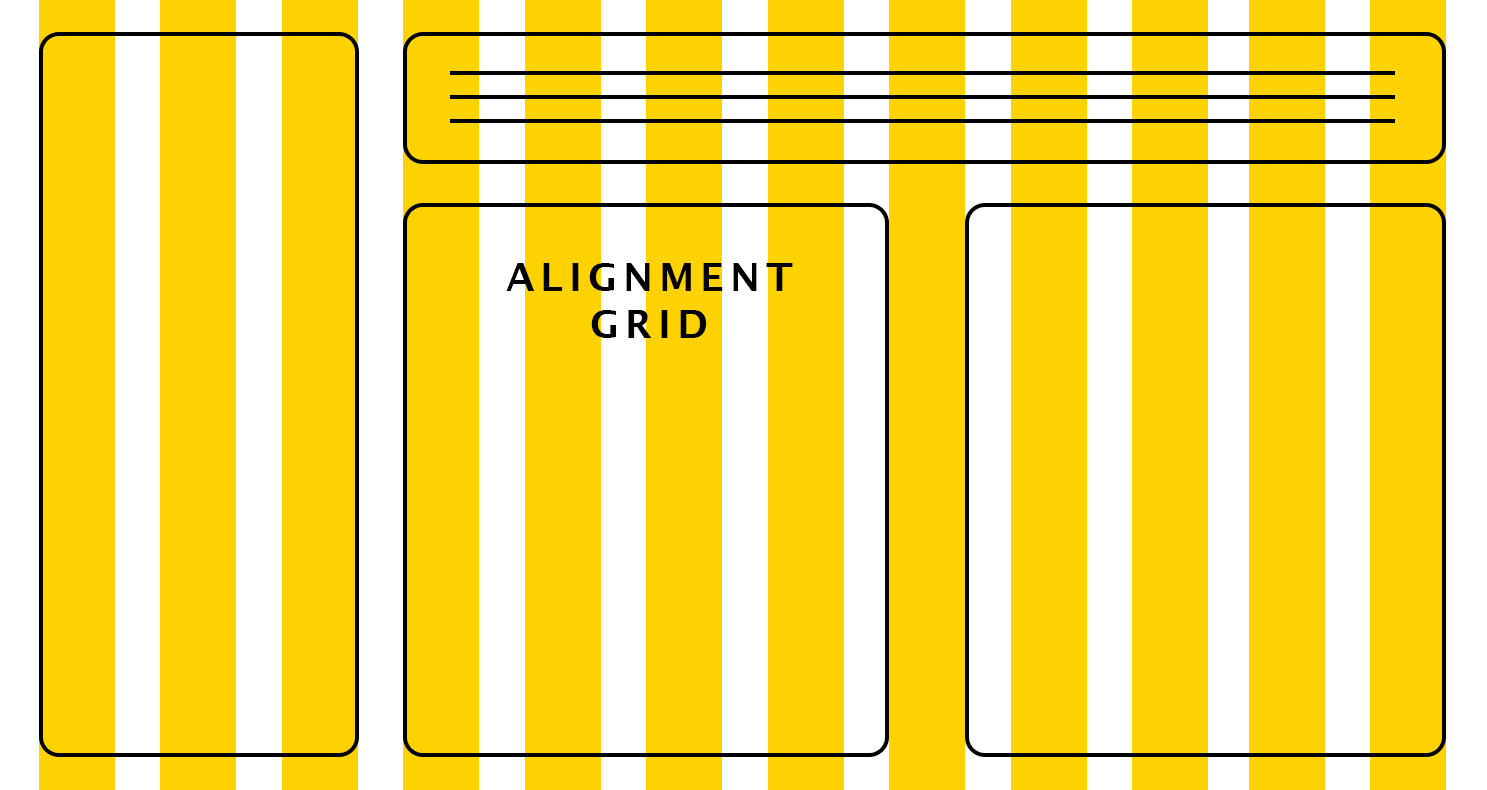
Alignment Grid
A structured layout guide that helps position elements for balanced compositions.
⭐ Example: Websites use 12-column grids to align content across different screen sizes.
? Common Mistake: Ignoring grids in typography, leading to misaligned text blocks.
? Pro Tip: Use baseline grids in InDesign to maintain consistent line spacing.
Additive Color Model
A color system used in digital screens, combining red, green, and blue (RGB) light to create colors.
⭐ Example: When all colors are combined at full intensity, they produce white light.
? Common Mistake: Using the additive color model (RGB) for print, which requires CMYK instead.
? Pro Tip: Always check the color mode in Photoshop or Illustrator when switching between digital and print design.
Adobe Creative Cloud
A suite of professional design software including Photoshop, Illustrator, InDesign, After Effects, and more.
⭐ Example: Illustrators use Photoshop for raster art, while logo designers prefer Illustrator for vector graphics.
? Common Mistake: Not updating software, which can cause compatibility issues with fonts and assets.
? Pro Tip: Use Adobe Libraries to sync fonts, colors, and assets across different Adobe programs.
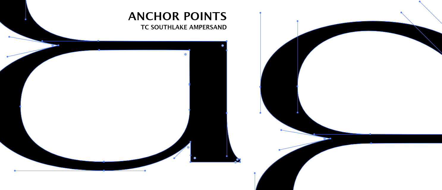
Anchor Points
Editable points in vector graphics that define the shape of a path.
⭐ Example: Used in Adobe Illustrator and SVG files for precision drawing.
? Common Mistake: Adding too many anchor points, which makes paths harder to edit.
? Pro Tip: Use simplified paths with the “Simplify Path” tool in Illustrator for cleaner vectors.
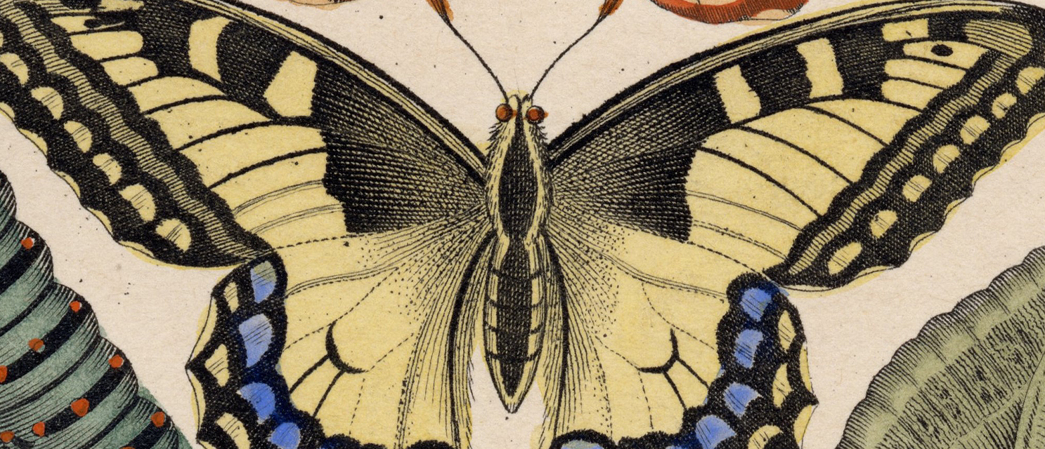
Analog Design (My favorite!)
A handcrafted approach to typography, illustration, and design before digital tools existed.
⭐ Example: Letterpress printing, woodcut illustrations, and hand-drawn lettering.
? Common Mistake: Assuming analog design is obsolete. Many high-end brands use analog techniques for authenticity (or purchase and use assets that do – like ours!)
? Pro Tip: Blend analog and digital by scanning hand-drawn sketches and vectorizing them in Illustrator!
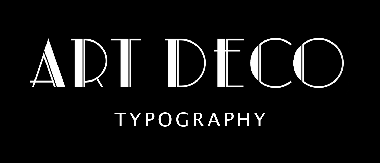
Art Deco Typography
A typographic style from the 1920s-30s, featuring geometric, bold, and decorative letterforms.
⭐ Example: Fonts like Artdeco MN and Broadway capture the classic Art Deco aesthetic beautifully.
? Common Mistake: Using Art Deco fonts in small body text, which reduces readability.
? Pro Tip: Pair Art Deco fonts with minimalist sans-serifs for modern branding.
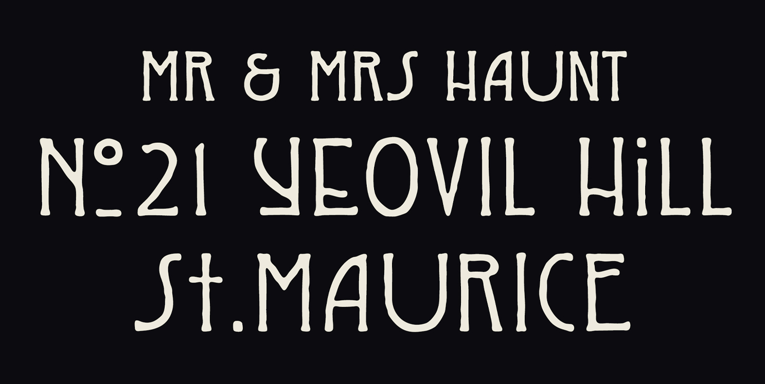
Art Nouveau Typography
A flowing, decorative type style inspired by organic forms and curves from the late 19th century.
⭐ Example: Fonts like Arnold Böcklin and Rennie Mackintosh are classic Art Nouveau typefaces.
? Common Mistake: Using Art Nouveau fonts in corporate settings, where simpler typography is preferred.
? Pro Tip: Combine Art Nouveau lettering with vintage illustrations and borders for an authentic feel!
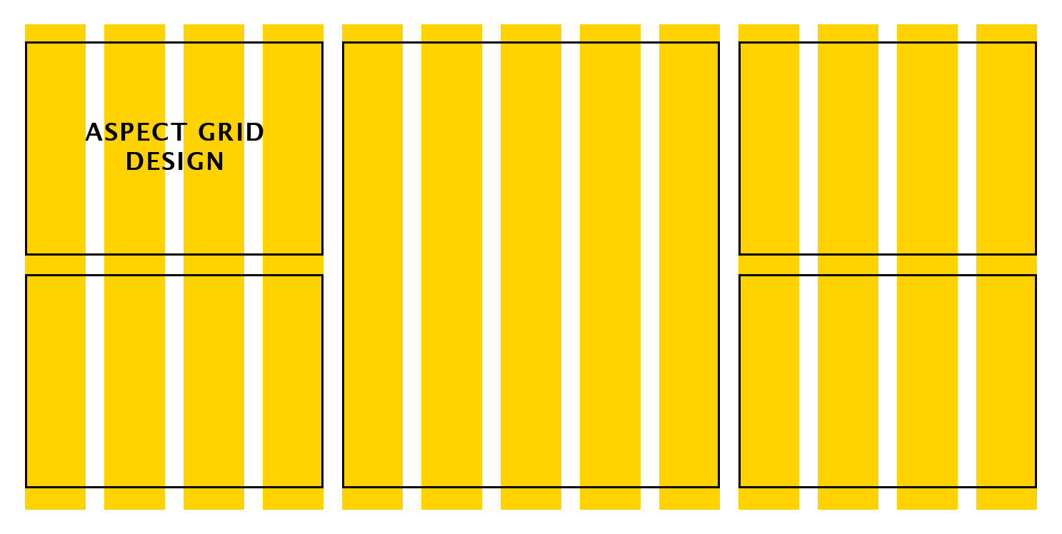
Aspect Grid
A proportional layout tool used to maintain visual harmony in design compositions.
⭐ Example: Used in editorial design and website UI layouts to align elements.
? Common Mistake: Ignoring aspect grids, leading to misaligned text and images.
? Pro Tip: In InDesign and Figma, use the grid overlay tool for precise alignment.
Asset Management
The practice of organizing and storing design assets for efficiency and consistency.
⭐ Example: Large design teams use cloud-based asset libraries like Dropbox or Adobe Libraries.
? Common Mistake: Not properly naming files, making it difficult to find assets later.
? Pro Tip: Pay attention to the licensing of your assets and organise, organise, organise!
Auto-Tracing
A feature in vector software that converts raster images into editable vector paths.
⭐ Example: Adobe Illustrator’s Live Trace tool is used to convert raster artwork into vectors. We use it for our Vintage Illustrations!
? Common Mistake: Using the default settings within the auto-trace tool! Play around with those to get much better results.
? Pro Tip: If your raster image is large, with a lot of white space – Adobe Illustrator may not give you the best results – try Inkscape! It’s free and fantastic at capturing detail.
Baseline
The invisible line on which most letters sit in typography.
⭐ Example: In fonts like Arial or Times New Roman, the baseline ensures consistent text alignment.
? Common Mistake: Misaligning text baselines when combining multiple fonts in a design.
? Pro Tip: Use baseline grids in InDesign or Figma to maintain alignment across text blocks.
Bitmap (Raster) Image
An image composed of pixels, as opposed to vector graphics.
⭐ Example: JPEG, PNG, and GIF files are all bitmap images.
? Common Mistake: Enlarging bitmap images without resampling, which causes pixelation.
? Pro Tip: Convert bitmap images to vector format (SVG, AI) when possible for scalability.
Body Text
The primary text in a design, usually in paragraphs or blocks.
⭐ Example: A book’s main content is set in a highly readable serif font like Garamond.
? Common Mistake: Using display fonts (e.g., decorative typefaces) for body text, reducing legibility.
? Pro Tip: Keep body text between 10-12pt for optimal readability in print and digital design.
Bevel
A design effect that gives the appearance of raised or angled edges.
⭐ Example: 3D typography and logo designs often use bevel effects for added depth.
? Common Mistake: Overusing bevels, which can make designs look outdated or overly processed.
? Pro Tip: Pair subtle bevel effects with shadows to create a more natural 3D look.
Brand Identity
A collection of visual and conceptual elements that define a brand’s aesthetic and message.
⭐ Example: Coca-Cola’s logo, red color scheme, and Spencerian script typography are key parts of its brand identity.
? Common Mistake: Inconsistency in fonts, colors, or design elements across platforms.
? Pro Tip: Maintain brand consistency by using a style guide that outlines fonts, colors, and logos.
Bold Typeface
A heavier-weight version of a font used for emphasis.
⭐ Example: Montserrat Bold is commonly used for headlines and attention-grabbing text.
? Common Mistake: Using bold text for entire paragraphs, making content harder to read.
? Pro Tip: Use bold sparingly to highlight key phrases or calls to action.
Bleed
An area beyond the final trim of a printed document to account for cutting inconsistencies.
⭐ Example: Business cards typically have a 3mm bleed to ensure colors extend to the edge after trimming.
? Common Mistake: Forgetting to add bleed in print designs, resulting in white edges.
? Pro Tip: Set up your print files with at least 3mm (0.125 inches) bleed in Adobe InDesign or Illustrator.
Brush Script
A type of script font that mimics hand-painted brush strokes.
⭐ Example: The Lobster font is a popular brush script used in branding and packaging.
? Common Mistake: Using brush scripts for long-form text, which can reduce readability.
? Pro Tip: Use brush script fonts for logos, social media graphics, and short headlines.
Bézier Curve
A mathematical curve used in vector design software to create smooth, scalable lines.
⭐ Example: Adobe Illustrator’s Pen Tool uses Bézier curves for precise vector drawing.
? Common Mistake: Adding too many anchor points, making paths harder to edit.
? Pro Tip: Use as few anchor points as possible for cleaner, smoother curves.
Bilateral Serif
A type of serif where both sides of a stroke feature symmetrical decorative serifs.
⭐ Example: Tuscan-style typefaces often use bilateral serifs for an ornamental look.
? Common Mistake: Using bilateral serifs in body text, which can reduce legibility.
? Pro Tip: Use bilateral serif fonts for vintage branding and poster designs.
Backdrop Blur
A visual effect that softens the background while keeping foreground elements sharp.
⭐ Example: Apple’s macOS UI uses backdrop blur in its interface to create depth.
? Common Mistake: Overusing blur effects, making text and icons difficult to read.
? Pro Tip: Keep blur strength subtle to maintain a professional aesthetic.
Baseline Shift
A typographic adjustment that moves characters above or below the baseline.
⭐ Example: Superscripts and subscripts use baseline shifts to position text correctly.
? Common Mistake: Manually shifting baselines instead of using OpenType features.
? Pro Tip: Use character formatting tools in InDesign or Illustrator for precise baseline adjustments.
Book Weight
A font weight that is slightly heavier than regular but lighter than bold.
⭐ Example: Roboto Book provides better readability for long-form content than Regular weight.
? Common Mistake: Using Book weight in small sizes, making text appear too light.
? Pro Tip: Choose Book weight for printed materials like novels and editorial layouts.
Breakpoints (Responsive Design)
Screen width measurements where website layouts adjust for different devices.
⭐ Example: Websites shift layouts at 768px (tablet) and 1024px (desktop) breakpoints.
? Common Mistake: Not designing for mobile-first, causing usability issues on smaller screens.
? Pro Tip: Use flexible grids and media queries to ensure smooth layout transitions.
Bubble Text
A type style where letters are rounded and often mimic inflated balloons.
⭐ Example: Comic Sans and Hobo have characteristics of bubble-style typography.
? Common Mistake: Using bubble text for professional branding, where clean, modern fonts are more appropriate.
? Pro Tip: Use bubble text sparingly for fun, playful projects like children’s designs or comic book lettering.
Byline
A credit line for the author, designer, or illustrator of a work.
⭐ Example: Magazines often include a byline stating “Written by John Doe” below the title.
? Common Mistake: Omitting bylines in professional projects, making it unclear who created the work.
? Pro Tip: Ensure bylines are legible but subtle to maintain the design hierarchy.
Calligraphic Typeface
A font style that mimics handwritten calligraphy, often featuring elegant strokes and flourishes.
⭐ Example: Zapfino and Bickham Script are popular calligraphic fonts.
? Common Mistake: Using calligraphic fonts for body text, reducing readability.
? Pro Tip: Use calligraphic fonts for logos, invitations, and branding to add sophistication.
Cap Height
The height of uppercase letters in a typeface, measured from the baseline.
⭐ Example: In Times New Roman, the cap height is slightly shorter than its ascender height.
? Common Mistake: Mixing fonts with inconsistent cap heights, leading to unbalanced typography.
? Pro Tip: Choose fonts with similar cap heights for cohesive branding and pairing.
Character Set
A complete collection of letters, numbers, punctuation, and symbols within a typeface.
⭐ Example: OpenType fonts often include extended character sets with ligatures and alternate glyphs.
? Common Mistake: Assuming all fonts support special characters or multilingual text.
? Pro Tip: Check a font’s glyph panel in Adobe Illustrator before using it for multilingual projects.
Chromatic Typeface
A typeface designed to layer multiple colors and effects for vibrant typography.
⭐ Example: Lobster Chromatic allows designers to mix different styles for layered effects.
? Common Mistake: Using chromatic fonts without proper layering, resulting in unreadable text.
? Pro Tip: Combine bold colors and gradients when using chromatic typefaces for posters and signage.
CMYK (Cyan, Magenta, Yellow, Black)
A color model used in printing, based on subtractive color mixing.
⭐ Example: Offset printing relies on CMYK for accurate color reproduction.
? Common Mistake: Designing for print in RGB, leading to unexpected color shifts when printed.
? Pro Tip: Convert RGB artwork to CMYK in Photoshop or Illustrator before sending it to print.
Color Harmony
A concept in design where colors are chosen based on their relationship on the color wheel.
⭐ Example: Triadic and analogous color schemes create visually appealing designs.
? Common Mistake: Using clashing colors, making text and backgrounds difficult to read.
? Pro Tip: Use Adobe Color (formerly Kuler) to find harmonious color combinations.
Condensed Typeface
A font with narrower letterforms, designed to fit more text into limited space.
⭐ Example: Helvetica Condensed and Bebas Neue are popular condensed typefaces.
? Common Mistake: Using condensed fonts for small text, making it harder to read.
? Pro Tip: Pair condensed fonts with extended fonts for contrast in branding and posters.
Contrast (Typography & Design)
The difference between elements (color, size, weight) to create hierarchy and visual interest.
⭐ Example: Bold headlines with light body text create strong contrast in editorial design.
? Common Mistake: Low contrast between text and background, reducing legibility.
? Pro Tip: Test designs in grayscale mode to ensure sufficient contrast for readability.
Counter (Typography)
The enclosed or partially enclosed space within a letterform.
⭐ Example: The space inside “O”, “P”, and “D” is called a counter.
? Common Mistake: Using fonts with tight counters in small sizes, reducing clarity.
? Pro Tip: Open counter fonts (e.g., Gill Sans) are more readable for digital use.
Creative Commons License
A licensing system that allows designers to use, modify, or distribute work with conditions.
⭐ Example: CC0 (Public Domain) allows free use without attribution.
? Common Mistake: Assuming all Creative Commons licenses allow commercial use.
? Pro Tip: Always check the specific CC license terms before using an asset commercially.
Cross-Hatching
A shading technique using intersecting parallel lines to create depth in illustrations.
⭐ Example: Used in pen and ink sketches, engraving, and etching techniques.
? Common Mistake: Overlapping too many lines, making shading look messy.
? Pro Tip: Use denser cross-hatching for darker shadows and fewer lines for highlights.
CSS Grid
A web design layout system used to create responsive designs.
⭐ Example: 12-column grid systems in CSS provide flexibility in modern web layouts.
? Common Mistake: Using CSS floats instead of Grid or Flexbox, leading to inefficient layouts.
? Pro Tip: Combine CSS Grid and Flexbox for advanced responsive web design.
Cutout Illustration
A technique where elements are isolated from their background to create layered compositions.
⭐ Example: Collage-style designs often use cutout illustrations for a handcrafted effect.
? Common Mistake: Rough cutouts with visible edges, making designs look unpolished.
? Pro Tip: Use feathering and layer masks in Photoshop to create smooth cutouts.
Cursive Typeface
A typeface that mimics handwritten script, often used for elegant and decorative designs.
⭐ Example: Dancing Script and Pacifico are popular cursive typefaces.
? Common Mistake: Using cursive fonts in all caps, which reduces readability.
? Pro Tip: Use cursive fonts for wedding invitations, luxury branding, and decorative headings.
Descender
The portion of a lowercase letter that extends below the baseline.
⭐ Example: Letters like g, j, p, q, and y have descenders.
? Common Mistake: Using tight line spacing (leading), which causes descenders to overlap with the line below.
? Pro Tip: Increase leading (line spacing) when using fonts with long descenders to improve readability.
Display Typeface
A typeface designed specifically for large text, like headlines and posters.
⭐ Example: Impact, Playfair Display, and Cooper Black are popular display fonts.
? Common Mistake: Using display typefaces for body text, reducing readability.
? Pro Tip: Use display fonts for emphasis, and pair them with cleaner sans-serifs for body text.
Dingbat
A decorative symbol, icon, or ornament included in a typeface.
⭐ Example: Wingdings and Zapf Dingbats are well-known dingbat fonts.
? Common Mistake: Assuming dingbats are images—they are actually font-based symbols.
? Pro Tip: Use dingbats for decorative bullets, embellishments, or custom icons in designs.
Drop Cap
A large, decorative capital letter at the start of a paragraph.
⭐ Example: Used in magazines, books, and editorial layouts to add emphasis to the opening text.
? Common Mistake: Using drop caps in narrow columns, which can disrupt text flow.
? Pro Tip: Ensure line height and spacing accommodate the drop cap without disrupting readability.
Duotone
A design technique that uses two contrasting colors to create depth and style.
⭐ Example: Spotify’s album artwork often features duotone imagery.
? Common Mistake: Choosing low-contrast colors, which reduces impact.
? Pro Tip: Combine a dark and vibrant color to make duotone images stand out.
DPI (Dots Per Inch)
A measurement of image resolution in print, affecting clarity and sharpness.
⭐ Example: 300 DPI is standard for high-quality printing.
? Common Mistake: Printing low-DPI (72 DPI) images, resulting in blurry prints.
? Pro Tip: Always export print files at 300 DPI to maintain quality.
Dummy Text
Placeholder text used to fill space in a design layout before the final content is added.
⭐ Example: Lorem Ipsum is the most widely used dummy text.
? Common Mistake: Forgetting to replace dummy text before publishing or printing.
? Pro Tip: Use Lorem Ipsum generators or AI-powered text placeholders to simulate realistic content.
Dynamic Typography
A design style where text moves, animates, or reacts to user interaction.
⭐ Example: Kinetic typography in motion graphics and website headers.
? Common Mistake: Overusing animation, making the design distracting.
? Pro Tip: Keep dynamic typography subtle and purposeful, especially in UX/UI design.
Drop Shadow
A visual effect that adds depth by placing a soft shadow behind an object or text.
⭐ Example: Used in logos, buttons, and UI elements for contrast and legibility.
? Common Mistake: Using hard-edged drop shadows, making text look outdated.
? Pro Tip: Apply blurred, soft shadows for a modern, subtle effect.
Die Cut
A printing technique where custom shapes are cut out from a material.
⭐ Example: Business cards, packaging, and sticker designs often use die cuts.
? Common Mistake: Not accounting for bleed margins, which can cause cutting errors.
? Pro Tip: Add a safety margin and bleed in your design to ensure accurate cutting.
Digital Painting
A technique that mimics traditional painting using digital tools and brushes.
⭐ Example: Used in concept art, illustrations, and character design.
? Common Mistake: Relying too much on basic airbrushes, resulting in flat artwork.
? Pro Tip: Use texture brushes and multiple layers to add realism and depth.
Depth of Field (DOF)
A photography and design term that refers to the focus range in an image.
⭐ Example: Portraits with blurred backgrounds have a shallow depth of field.
? Common Mistake: Using too much background blur, making subjects feel unnatural.
? Pro Tip: Adjust aperture (f-stop) settings in photography for natural DOF effects.
Dither
A technique used in low-resolution graphics to simulate more colors and gradients.
⭐ Example: Pixel art and retro game graphics often use dithering for shading.
? Common Mistake: Overusing dither effects in high-resolution graphics, reducing clarity.
? Pro Tip: Use subtle dithering to create a vintage or pixel-art aesthetic.
Double Exposure
A technique where two images are blended together to create artistic compositions.
⭐ Example: Fashion photography and surreal artwork often use double exposure.
? Common Mistake: Blending images without adjusting opacity, making them look cluttered.
? Pro Tip: Use layer masks and blending modes in Photoshop to refine double exposure effects.
Distressed Typeface
A typeface with a weathered or aged appearance, mimicking imperfections.
⭐ Example: Rustic or grunge fonts often have distressed textures.
? Common Mistake: Using distressed fonts in corporate branding, where clean typography is preferred.
? Pro Tip: Use distressed fonts for vintage logos, band posters, and retro packaging.
Dark Mode (UI Design)
A design trend where interfaces use dark backgrounds to reduce eye strain.
⭐ Example: Apps like Instagram, Twitter, and macOS have built-in dark mode options.
? Common Mistake: Using low-contrast text in dark mode, making content hard to read.
? Pro Tip: Adjust contrast and saturation levels when designing for dark mode.
Ear (Typography)
A small stroke or flourish extending from the upper-right bowl of a lowercase ‘g’ or similar letters.
⭐ Example: Fonts like Georgia and Times New Roman have distinctive ears on their lowercase ‘g’.
? Common Mistake: Overlooking the ear in type selection, which can impact character recognition.
? Pro Tip: Use typefaces with distinctive ears to enhance brand personality and uniqueness.
Embossing
A printing technique that raises a design above the paper surface for a tactile effect.
⭐ Example: Business cards with embossed lettering feel luxurious and premium.
? Common Mistake: Using thin paper stock, which can tear or fail to hold the embossed shape.
? Pro Tip: Pair embossing with foil stamping for an elegant, high-end look.
Em Dash
A longer dash (—) used for emphasis or breaks in thought.
⭐ Example: Typography—especially well-spaced lettering—makes a design feel polished.
? Common Mistake: Using double hyphens (–) instead of an actual em dash, reducing readability.
? Pro Tip: On Mac, type Shift + Option + – to insert an em dash instantly.
En Dash
A shorter dash (–) used for number ranges or relationships.
⭐ Example: The event runs from June 1–June 15.
? Common Mistake: Confusing en dashes with hyphens (-), which should not be used for date ranges.
? Pro Tip: Use Option + – (Mac) or Alt + 0150 (Windows) for proper en dash formatting.
Em Space
A typographic space equal to the width of a capital ‘M’ in the current typeface.
⭐ Example: Used in book design and justified text spacing for elegant readability.
? Common Mistake: Using multiple spacebar hits instead of proper em spacing.
? Pro Tip: In InDesign, use Ctrl + Shift + M to insert an em space.
Engraving
A printmaking technique where designs are carved into a surface for high-detail prints.
⭐ Example: Banknotes and fine invitations often feature engraved designs.
? Common Mistake: Trying to replicate engraving with low-resolution raster graphics.
? Pro Tip: Use Adobe Illustrator’s engraving brushes for digital replication of the style.
EPS (Encapsulated PostScript)
A vector file format used for high-resolution, scalable graphics.
⭐ Example: Logos and illustrations are often saved as EPS files for professional printing.
? Common Mistake: Trying to open an EPS file in software that doesn’t support vectors, resulting in pixelation.
? Pro Tip: Open EPS files in Adobe Illustrator for full editing capabilities.
Etching
A printmaking method where acid is used to carve an image into a metal plate.
⭐ Example: Vintage book illustrations were often created using etching techniques.
? Common Mistake: Confusing etching with engraving—etching uses acid, while engraving uses a burin tool.
? Pro Tip: To create digital etching effects, use hatching techniques in Photoshop or Illustrator.
Expanded Typeface
A wider-than-normal version of a typeface, often used in display typography.
⭐ Example: Impact and Bebas Neue Expanded are designed for bold, attention-grabbing headlines.
? Common Mistake: Using expanded fonts for body text, making long paragraphs difficult to read.
? Pro Tip: Pair expanded fonts with narrow fonts for contrast in branding.
Expressionism in Design
A style characterized by exaggerated forms and bold visual elements to convey emotion.
⭐ Example: German Expressionist movie posters from the 1920s feature distorted shapes and dramatic contrast.
? Common Mistake: Overloading a design with too many expressive elements, making it chaotic.
? Pro Tip: Use strong contrast and asymmetry for expressive yet balanced compositions.
Exposure (Photography & Design)
The amount of light captured in an image, affecting brightness and contrast.
⭐ Example: Overexposure makes images too bright, while underexposure makes them too dark.
? Common Mistake: Not adjusting exposure for different lighting conditions, leading to unnatural images.
? Pro Tip: Use Photoshop’s Levels or Curves tool to fine-tune exposure.
Extrude (3D Design)
A process that extends a 2D shape into a 3D form.
⭐ Example: Used in logos and UI elements for depth and realism.
? Common Mistake: Overusing extrusion effects, making designs look bulky.
? Pro Tip: Apply subtle extrusion with lighting effects for a polished 3D look.
Eye (Typography)
The enclosed counter within a lowercase ‘e’.
⭐ Example: Sans-serif fonts often have larger eyes for better legibility.
? Common Mistake: Choosing fonts with tight eyes for small text sizes, reducing clarity.
? Pro Tip: Open eye fonts (e.g., Verdana) are ideal for web readability.
Eyedropper Tool
A design tool that samples colors from an image or element.
⭐ Example: Used in Photoshop and Illustrator to match brand colors perfectly.
? Common Mistake: Sampling colors from shadows or highlights, resulting in inaccurate color choices.
? Pro Tip: Sample from flat, neutral areas for precise color matching.
Edge Highlighting
A technique that adds a glow or light source to the edges of a design element.
⭐ Example: Used in game UI, neon text effects, and futuristic designs.
? Common Mistake: Overusing hard-edged highlights, making elements look unnatural.
? Pro Tip: Use soft, gradient edge highlights for realistic lighting effects.
Echo Effect (Typography & Design)
A style where repeated layers of text create a 3D echo-like effect.
⭐ Example: Retro 80s-style typography often uses echo effects for depth.
? Common Mistake: Using too many layers, making text unreadable.
? Pro Tip: Adjust opacity and blur for subtle, dynamic echoes.
Feathering
A technique that softens the edges of an image or selection for a smoother transition.
⭐ Example: Used in Photoshop for blending elements into a background.
? Common Mistake: Over-feathering, causing loss of detail and excessive blurriness.
? Pro Tip: Use a subtle 2-5px feather for natural blending in photo edits.
Final Artwork (FA)
A print-ready or production-ready file, fully optimized for final output.
⭐ Example: Logos, business cards, and packaging require FA files before printing.
? Common Mistake: Submitting low-resolution files instead of high-quality vector formats.
? Pro Tip: Always export print artwork as PDF/X-1a to ensure proper color and resolution.
Faux Bold
A software-generated bold effect applied to a font that doesn’t have a true bold weight.
⭐ Example: Some applications force-bold fonts when a true bold version isn’t available.
? Common Mistake: Faux bold distorts letterforms, making text look unbalanced.
? Pro Tip: Always use a proper bold font variant instead of faux bold styling.
Flat Design
A minimalist design style that avoids shadows, gradients, and 3D effects.
⭐ Example: Google’s Material Design is a form of flat design with subtle depth.
? Common Mistake: Making interfaces too simplistic, reducing usability.
? Pro Tip: Add micro-interactions and slight layering to enhance flat design.
Flourish
A decorative stroke or embellishment added to typography or illustrations.
⭐ Example: Wedding invitations often feature script fonts with elegant flourishes.
? Common Mistake: Overusing flourishes in body text, reducing legibility.
? Pro Tip: Keep flourishes subtle and intentional to enhance, not overwhelm.
Font Family
A group of related fonts that include different weights, styles, and variations.
⭐ Example: Roboto includes Thin, Regular, Bold, and Italic variants in its family.
? Common Mistake: Mixing fonts from unrelated families, causing inconsistency.
? Pro Tip: Stick to one or two font families per design for a cohesive look.
Foil Stamping
A printing process where metallic or colored foil is applied using heat and pressure.
⭐ Example: Gold foil-stamped business cards create a luxurious feel.
? Common Mistake: Choosing thin text for foil stamping, which reduces clarity.
? Pro Tip: Use bold, high-contrast text for the best foil results.
Foreground
The part of a design that appears closest to the viewer, contrasting with the background.
⭐ Example: UI buttons are in the foreground, while the page background remains static.
? Common Mistake: Making foreground elements too similar in color to the background, reducing contrast.
? Pro Tip: Increase color contrast and drop shadows to separate layers.
Four-Color Process Printing
A standard CMYK printing technique that creates full-color images using cyan, magenta, yellow, and black inks.
⭐ Example: Magazines and brochures are printed using four-color process printing.
? Common Mistake: Sending RGB files to print, which results in inaccurate colors.
? Pro Tip: Convert artwork to CMYK before printing for best results.
Fraktur Typeface
A gothic or blackletter-style font, often associated with historical and medieval designs.
⭐ Example: Newspapers and old German books often used Fraktur typefaces.
? Common Mistake: Using Fraktur fonts in modern branding, where readability is essential.
? Pro Tip: Use Fraktur sparingly for vintage, tattoo, or decorative branding.
Freeform Gradients
A gradient style that flows organically, rather than in a linear or radial path.
⭐ Example: Adobe Illustrator’s Freeform Gradient Tool allows for smooth, custom color blending.
? Common Mistake: Using too many colors, creating chaotic designs.
? Pro Tip: Stick to two or three key colors for a balanced gradient effect.
French Curve
A design tool used for drawing smooth curves, often in typography and illustration.
⭐ Example: Used in lettering and architectural sketches before digital tools became mainstream.
? Common Mistake: Over-relying on software tools, losing the organic quality of hand-drawn curves.
? Pro Tip: Use French curves for initial sketches, then refine them digitally.
Full Justification
A text alignment style where all lines are evenly spaced to fit the width of a column.
⭐ Example: Newspaper columns and book layouts often use full justification.
? Common Mistake: Justifying text without adjusting kerning, leading to large gaps.
? Pro Tip: Use hyphenation and adjusted tracking to create smoother justified text.
Futurism in Design
A design movement emphasizing speed, technology, and progress, often with geometric elements.
⭐ Example: Futuristic movie posters use sharp angles, neon colors, and sleek typography.
? Common Mistake: Overusing sharp edges and metallic textures, making designs feel cluttered.
? Pro Tip: Use gradients, bold typography, and geometric patterns for futuristic styles.
Gamut (Color Gamut)
The range of colors that a device or medium can display or reproduce.
⭐ Example: RGB screens have a wider gamut than CMYK prints, meaning some colors can’t be accurately printed.
? Common Mistake: Designing in RGB for a print project, leading to unexpected color shifts.
? Pro Tip: Use soft-proofing in Photoshop to check how colors will convert from RGB to CMYK.
Geometric Typeface
A typeface with shapes based on simple geometric forms, such as circles, squares, and triangles.
⭐ Example: Futura and Avant Garde are classic geometric typefaces.
? Common Mistake: Using geometric fonts for body text, which may feel rigid and less readable.
? Pro Tip: Pair geometric typefaces with humanist or serif fonts for contrast.
Ghosting (Print Design)
A faint duplicate image or shadow effect caused by printing issues.
⭐ Example: Ghosting occurs in offset printing when ink transfer is uneven.
? Common Mistake: Overusing light colors on uncoated paper, increasing ghosting risk.
? Pro Tip: Work with professional printers to test ink coverage before large-scale printing.
GIF (Graphics Interchange Format)
A bitmap image format that supports animation and transparency.
⭐ Example: Used for short looping animations on social media and websites.
? Common Mistake: Using GIFs for high-quality images, which results in poor compression.
? Pro Tip: Use PNG for static transparent images and MP4 for high-quality animations.
Golden Ratio (1.618:1)
A mathematical proportion used in design and typography to create balanced, harmonious layouts.
⭐ Example: Logos, book layouts, and grids often use the Golden Ratio to enhance visual appeal.
? Common Mistake: Forcing the Golden Ratio into all designs, which isn’t always necessary.
? Pro Tip: Use the Golden Ratio as a guide, but trust your artistic judgment.
Gradient
A gradual transition between two or more colors.
⭐ Example: Spotify’s branding and Instagram’s logo use vibrant gradients.
? Common Mistake: Using too many colors in a gradient, making it muddy.
? Pro Tip: Stick to two or three colors for a clean, professional gradient effect.
Grayscale
A monochrome color mode that uses only shades of gray.
⭐ Example: Used for black-and-white printing and accessibility testing.
? Common Mistake: Converting RGB to grayscale without adjusting contrast, making images appear dull.
? Pro Tip: Use adjustment layers to fine-tune grayscale tones.
Grid System
A structural framework used in layout design to ensure alignment and consistency.
⭐ Example: Websites use 12-column grids for responsive layouts.
? Common Mistake: Ignoring grids, leading to misaligned elements.
? Pro Tip: Use grid templates in Figma, Adobe XD, or InDesign for structured designs.
Gutter (Typography & Layouts)
The space between columns of text or page margins.
⭐ Example: Newspapers use gutter spacing to separate text columns.
? Common Mistake: Making gutters too narrow, causing readability issues.
? Pro Tip: Adjust gutter width based on font size to ensure proper spacing.
Gyotaku (Japanese Printmaking)
A traditional printmaking technique using inked fish or objects to create impressions on paper.
⭐ Example: Used in Japanese art and nature-inspired illustration.
? Common Mistake: Applying too much ink, losing fine details.
? Pro Tip: Use light, even ink layers for clear, intricate prints.
Halftone
A printing technique that simulates shades of gray or color using dots of varying sizes and spacing.
⭐ Example: Vintage newspaper photos use halftone dots.
? Common Mistake: Using halftones at low resolution, making prints look pixelated.
? Pro Tip: Use at least 300 DPI for halftone prints.
Hand-Lettering
Custom-drawn lettering, often used for logos, posters, and artistic typography.
⭐ Example: Chalkboard café menus and custom type logos.
? Common Mistake: Treating hand-lettering as a font instead of a unique design element.
? Pro Tip: Scan hand-drawn lettering and vectorize it in Illustrator for digital use.
Hard Light (Blending Mode)
A Photoshop blending mode that boosts contrast and sharpness between layers.
⭐ Example: Used in photo retouching and poster designs for dramatic effects.
? Common Mistake: Overusing hard light, creating harsh, unnatural shadows.
? Pro Tip: Reduce opacity when using hard light for subtle effects.
Hierarchical Typography
A layout approach where different font sizes, weights, and styles establish reading order.
⭐ Example: Magazine headlines are bold, subheadings are lighter, and body text is smaller.
? Common Mistake: Using too many typefaces, causing inconsistency.
? Pro Tip: Stick to two or three fonts with varied weights for hierarchy.
Humanist Typeface
A serif or sans-serif typeface inspired by handwritten forms, offering a natural, readable look.
⭐ Example: Gill Sans and Optima are classic humanist fonts.
? Common Mistake: Confusing humanist typefaces with geometric sans-serifs, which are more rigid.
? Pro Tip: Use humanist typefaces for books, websites, and branding to enhance warmth and approachability.
Hue (Color Theory)
The pure color without added black (shade) or white (tint).
⭐ Example: Red, blue, and yellow are primary hues.
? Common Mistake: Confusing hue with saturation or brightness.
? Pro Tip: Adjust hue, saturation, and brightness separately for precise color control.
Iconography
The visual language of symbols and icons used to convey meaning in design.
⭐ Example: UI/UX designers use icon sets like Material Icons and Font Awesome for interfaces.
? Common Mistake: Using too many different icon styles, making the design inconsistent.
? Pro Tip: Stick to one cohesive icon style (outline, filled, or flat) for a clean, unified look.
Illustrative Typography
A creative blend of typography and illustration, where letters become artistic elements.
⭐ Example: Hand-drawn typography in branding and posters.
? Common Mistake: Overcomplicating designs, making text difficult to read.
? Pro Tip: Keep illustrative typography balanced between legibility and artistic expression.
InDesign (Adobe InDesign)
A leading layout design software for editorials, books, and print materials.
⭐ Example: Used to design magazines, newspapers, and brochures.
? Common Mistake: Using Illustrator or Photoshop for multipage layouts, which limits efficiency.
? Pro Tip: Use InDesign’s master pages and paragraph styles for consistent formatting.
Ink Trap
A design feature in typefaces where small gaps are added to prevent ink bleeding in print.
⭐ Example: Newspaper fonts like Times New Roman have ink traps for clarity.
? Common Mistake: Using ink trap fonts in digital-only design, where it’s unnecessary.
? Pro Tip: Choose ink trap fonts for print-heavy designs to enhance legibility.
Isometric Illustration
A 3D-like drawing technique using parallel lines at a 30-degree angle to create depth.
⭐ Example: Used in game design, UI illustrations, and architectural drawings.
? Common Mistake: Mixing isometric with perspective-based illustrations, which looks inconsistent.
? Pro Tip: Use Illustrator’s isometric grid tool for precise alignment.
Justified Text
A text alignment style where all lines are evenly spaced to fill the width of a column.
⭐ Example: Newspapers and book layouts often use justified text for neat formatting.
? Common Mistake: Justifying text without adjusting spacing, leading to large, awkward gaps.
? Pro Tip: Use hyphenation and tracking adjustments to avoid excessive spacing issues.
Jaggies (Pixelation)
A visual artifact where stair-step-like edges appear on low-resolution images.
⭐ Example: Enlarging a small bitmap image results in jaggies.
? Common Mistake: Using low-DPI images in print, causing pixelation.
? Pro Tip: Always use high-resolution or vector graphics for scalable clarity.
JPEG (Joint Photographic Experts Group)
A common compressed image format for digital photos and web graphics.
⭐ Example: Photographs on websites are often in JPEG format.
? Common Mistake: Saving logos in JPEG, leading to loss of transparency and sharpness.
? Pro Tip: Use PNG or SVG for logos and JPEG for high-quality photos.
Kerning
The adjustment of space between individual characters in a word for better readability.
⭐ Example: T Y P O G R A P H Y needs kerning adjustments to look balanced.
? Common Mistake: Over-kerning or under-kerning, making text feel too tight or too loose.
? Pro Tip: Use optical kerning for natural spacing in body text.
Kinetic Typography
Animated text that moves, rotates, or transforms in video design.
⭐ Example: Used in title sequences, music videos, and motion graphics.
? Common Mistake: Overloading kinetic typography with too many effects, making it overwhelming.
? Pro Tip: Keep animations smooth and readable, focusing on key movement cues.
Knockout Text
A text effect where letters are cut out to reveal the background behind them.
⭐ Example: White text over an image with transparency.
? Common Mistake: Using knockout text on low-contrast backgrounds, making it hard to read.
? Pro Tip: Add a subtle shadow or stroke for better contrast.
Leading (Line Spacing)
The vertical space between lines of text for better readability.
⭐ Example: 1.5x line spacing improves reading flow in body text.
? Common Mistake: Using too little leading, causing text to feel cramped.
? Pro Tip: Set leading at least 120% of font size for optimal spacing.
Letterpress Printing
A traditional printing technique where raised letters are inked and pressed onto paper.
⭐ Example: Vintage business cards and wedding invitations often use letterpress.
? Common Mistake: Choosing thin, delicate fonts, which may not print clearly.
? Pro Tip: Use bold, high-contrast fonts for sharp letterpress results.
Macro Typography
The overall structure and arrangement of text in a design, including line length, spacing, and alignment.
⭐ Example: Used in book layouts and web design to ensure readability.
? Common Mistake: Ignoring hierarchy and spacing, making content difficult to follow.
? Pro Tip: Use a consistent grid system to organize macro typography effectively.
Manuscript Grid
A single-column layout used in books and long-form text for a smooth reading experience.
⭐ Example: Novels and academic papers use a manuscript grid for clarity.
? Common Mistake: Not balancing margins and line length, making text feel cluttered.
? Pro Tip: Keep line width between 50-75 characters for comfortable reading.
Masking (Design & Illustration)
A technique that hides or reveals parts of an image or layer without deleting pixels.
⭐ Example: Used in Photoshop and Illustrator for non-destructive editing.
? Common Mistake: Using erasers instead of masks, which makes changes irreversible.
? Pro Tip: Use layer masks in Photoshop for more flexible adjustments.
Moiré Effect
A visual distortion pattern that appears when fine lines overlap incorrectly in print or digital screens.
⭐ Example: Happens when scanning printed images with halftone patterns.
? Common Mistake: Printing with improper resolution, causing moiré artifacts.
? Pro Tip: Use Gaussian blur or adjust scan angles to reduce moiré patterns.
Monospaced Typeface
A typeface where each character takes up equal width, commonly used in coding and typewriters.
⭐ Example: Courier, Consolas, and Monaco are classic monospaced fonts.
? Common Mistake: Using monospaced fonts for body text, making large paragraphs harder to read.
? Pro Tip: Use monospaced fonts for code, labels, and industrial aesthetics.
Motion Graphics
The combination of animation and design elements to create engaging visuals.
⭐ Example: Title sequences in movies and animated UI interactions.
? Common Mistake: Using too many fast transitions, making text hard to read.
? Pro Tip: Keep animations under 3 seconds for smooth, professional results.
Muted Colors
Colors that have been desaturated or toned down for a softer appearance.
⭐ Example: Beige, dusty pink, and desaturated greens are common muted tones.
? Common Mistake: Using too many muted colors, making designs feel dull.
? Pro Tip: Pair muted and vibrant colors for contrast and depth.
Negative Space (White Space)
The empty space around design elements that improves clarity and balance.
⭐ Example: Apple’s minimalist branding heavily relies on negative space.
? Common Mistake: Filling every inch of space, creating cluttered layouts.
? Pro Tip: Give elements room to breathe by increasing margins and padding.
Non-Destructive Editing
A workflow that preserves the original image or design while making changes.
⭐ Example: Using layer masks instead of the eraser tool in Photoshop.
? Common Mistake: Editing directly on original layers, making revisions impossible.
? Pro Tip: Use adjustment layers and smart objects for flexible edits.
Oblique Typeface
A slanted version of a typeface, often used instead of true italics.
⭐ Example: Arial Oblique is not a true italic but a mechanically slanted version.
? Common Mistake: Confusing oblique with true italics, which have custom letterforms.
? Pro Tip: Use true italics in serif fonts for a more natural slant.
OpenType Font (OTF)
A font format that supports advanced typographic features, including ligatures and alternates.
⭐ Example: OTF fonts allow glyph variations, small caps, and discretionary ligatures.
? Common Mistake: Using TrueType (TTF) fonts instead of OpenType when extra features are needed.
? Pro Tip: Use OTF for professional design projects that require advanced typography.
Pantone Matching System (PMS)
A standardized color system used for consistent color reproduction in print.
⭐ Example: Pantone 286 C is a specific shade of blue used in branding.
? Common Mistake: Assuming Pantone colors match exactly in digital formats.
? Pro Tip: Convert Pantone colors to CMYK or RGB when working across print and web.
Pixelation
A visual effect where low-resolution images appear blocky due to visible pixels.
⭐ Example: Enlarging a 72 DPI image for print will result in pixelation.
? Common Mistake: Using low-resolution images in high-quality prints.
? Pro Tip: Always work with 300 DPI images for print projects.
Quadtone Printing
A printing process that uses four ink colors to create richer tonal values than duotone.
⭐ Example: Fine art photography books use quadtone printing for high-detail grayscale images.
? Common Mistake: Assuming quadtone means full-color (CMYK)—it’s for enhanced black-and-white printing.
? Pro Tip: Use quadtone printing for dramatic grayscale effects in high-end publications.
Query (UI/UX Design)
A structured request for retrieving data from a system, often used in databases and search engines.
⭐ Example: Search bars on websites use query-based algorithms to retrieve results.
? Common Mistake: Not optimizing search queries, leading to slow or inaccurate results.
? Pro Tip: Ensure filters and metadata are well-organized to improve search functionality.
Quick Mask (Photoshop)
A tool that creates temporary selections using a brush-based method.
⭐ Example: Used for soft edge selections and fine-tuning masks in photo retouching.
? Common Mistake: Forgetting to convert the quick mask back into a selection before applying effects.
? Pro Tip: Use feathering and Gaussian blur to refine selections smoothly.
Raster Graphics
Image files made of pixels instead of vectors, commonly used for photography.
⭐ Example: JPEG, PNG, and GIF are raster formats.
? Common Mistake: Enlarging raster images, causing pixelation and loss of detail.
? Pro Tip: Use vector graphics (SVG, AI) whenever scalability is needed.
Readability vs. Legibility
- Readability: How easily text can be understood in long-form content.
- Legibility: How clearly individual letters can be distinguished.
⭐ Example: Decorative fonts have legibility but low readability in body text.
? Common Mistake: Choosing script fonts for paragraphs, reducing readability.
? Pro Tip: Pair readable fonts for body text and legible display fonts for headings.
Responsive Typography
A design approach where text adapts to different screen sizes and devices.
⭐ Example: CSS fluid typography scales fonts based on viewport width.
? Common Mistake: Using fixed font sizes, making mobile text too large or too small.
? Pro Tip: Use relative units (em, rem, vw) instead of fixed pixels for scalable text.
Sans-Serif Typeface
A font without decorative serifs, offering a modern and clean appearance.
⭐ Example: Helvetica, Arial, and Futura are popular sans-serif fonts.
? Common Mistake: Assuming sans-serif is always better for digital—serifs improve readability in print.
? Pro Tip: Use sans-serifs for UI text and serifs for long-form reading.
Slab Serif
A serif typeface with thick, blocky serifs, often used for impact.
⭐ Example: Rockwell and Clarendon are popular slab serif fonts.
? Common Mistake: Using slab serifs for body text, which can feel heavy.
? Pro Tip: Use slab serifs for headlines, branding, and posters.
Spot Color Printing
A method where specific Pantone colors are used instead of CMYK blending.
⭐ Example: Coca-Cola’s red is a spot color to maintain brand consistency.
? Common Mistake: Mixing spot and CMYK colors improperly, leading to color mismatches.
? Pro Tip: Use spot colors for branding elements and logos for exact color reproduction.
Tracking (Letter-Spacing)
The consistent adjustment of space between all letters in a word or paragraph.
⭐ Example: Increasing tracking makes text feel more open and airy.
? Common Mistake: Using too much tracking on body text, making it harder to read.
? Pro Tip: Adjust tracking sparingly—tight for headlines, relaxed for paragraphs.
TrueType Font (TTF)
A widely used font format developed by Apple and Microsoft, with scalability and high-quality rendering.
⭐ Example: Arial and Times New Roman are TrueType fonts.
? Common Mistake: Assuming TTF has more features than OTF—OpenType (OTF) often includes extras.
? Pro Tip: Use OTF if additional glyphs, ligatures, and alternates are needed.
UI Typography
The use of fonts in user interfaces, ensuring readability and accessibility.
⭐ Example: Google’s Material Design uses Roboto for web and mobile apps.
? Common Mistake: Using thin fonts in UI, making them hard to read.
? Pro Tip: Choose fonts with clear distinction between letters (i, l, 1, 0, O) for clarity.
Uppercase (All Caps)
A text style where all letters are capitalized.
⭐ Example: Logos and warnings often use all caps for emphasis.
? Common Mistake: Using all caps for long text, reducing readability.
? Pro Tip: Use all caps for short headings or branding elements only.
Vector Graphics
Images based on mathematical paths, making them infinitely scalable without losing quality.
⭐ Example: Logos, illustrations, and icons are often created as vectors in AI or SVG format.
? Common Mistake: Using raster images instead of vectors for scalable designs.
? Pro Tip: Always design logos and branding assets in vector format to ensure flexibility.
Variable Fonts
Fonts that include multiple styles (weight, width, slant) within a single file.
⭐ Example: Inter Variable allows you to adjust weight dynamically without needing separate font files.
? Common Mistake: Using separate font weights instead of a variable font, increasing file size.
? Pro Tip: Use CSS “font-variation-settings” to customize variable fonts in web design.
Vignette Effect
A design technique where the edges of an image darken or blur, drawing focus to the center.
⭐ Example: Used in portrait photography and vintage-style posters.
? Common Mistake: Overusing vignettes, making the effect feel unnatural or outdated.
? Pro Tip: Use subtle vignettes to enhance focus without making them obvious.
Visual Hierarchy
The arrangement of elements to guide the viewer’s eye in order of importance.
⭐ Example: Bold headlines, larger fonts, and contrasting colors help establish hierarchy.
? Common Mistake: Making everything look equally important, causing visual confusion.
? Pro Tip: Use size, weight, and positioning to create clear focal points.
Verso (Printing)
The left-hand page of a book or spread, opposite the recto page.
⭐ Example: Verso pages often contain page numbers or supporting text.
? Common Mistake: Not aligning verso and recto pages properly, causing layout inconsistency.
? Pro Tip: Use master pages in InDesign for consistent verso-recto alignment.
Vanishing Point (Perspective Design)
A point on the horizon where parallel lines converge, creating depth in drawings.
⭐ Example: Used in 3D illustrations and perspective grids.
? Common Mistake: Misplacing the vanishing point, leading to distorted perspectives.
? Pro Tip: Use Photoshop’s Vanishing Point Tool for precise perspective edits.
Weight (Font Weight)
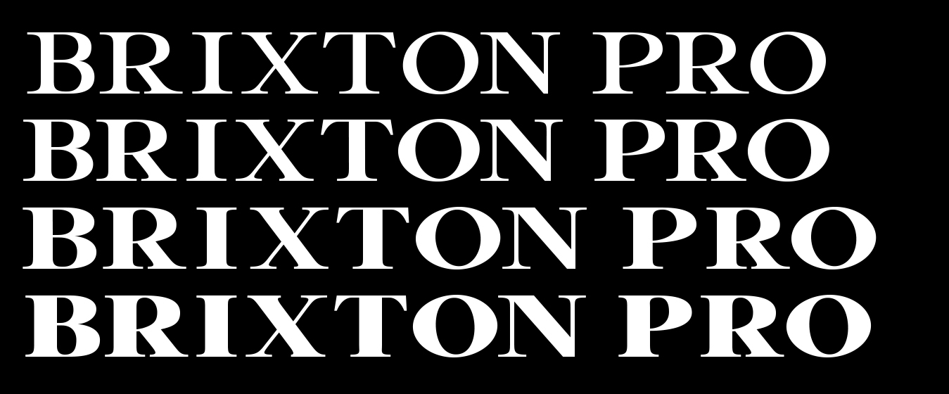
The thickness of a typeface, ranging from Thin to Black.
⭐ Example: TC Brixton PRO comes in Light, Regular, Bold and Heavy.
? Common Mistake: Using thin fonts at small sizes, making text unreadable – Also, using too many weights within one design is, more often than not, a bad idea.
? Pro Tip: Use bold weights for emphasis, regular for body text.
Widows & Orphans (Typography)
- Widow: A single word or short line left at the end of a paragraph.
- Orphan: A single word or line at the top of a new column or page.
⭐ Example: Newspapers avoid widows/orphans using hyphenation and text flow adjustments.
? Common Mistake: Leaving widows in professional layouts, making text look uneven.
? Pro Tip: Use paragraph settings in InDesign to prevent widows and orphans automatically.
White Space (Negative Space)
The empty areas around design elements that improve clarity and balance.
⭐ Example: Google’s homepage uses generous white space for simplicity.
? Common Mistake: Filling every inch with content, creating visual clutter.
? Pro Tip: Give text and images room to breathe by increasing margins and spacing. (Play around with Leading and Tracking with your typography!)
Wireframe (UI/UX Design)
A basic layout sketch that maps out a webpage or app before adding visuals.
⭐ Example: UX designers use Figma or Adobe XD to create wireframes before UI design begins.
? Common Mistake: Skipping wireframes, leading to poor UI structure later.
? Pro Tip: Use grayscale wireframes before adding colors and details. This helps you focus on the layout without allowing color to influence your UI decisions.
Wordmark (Logotype)
A logo based entirely on stylized text, without symbols or icons.
⭐ Example: Google, Coca-Cola, and FedEx logos are all wordmarks.
? Common Mistake: Using overly complex fonts, making wordmarks hard to read.
? Pro Tip: Use custom typography to create a unique wordmark that stands out.
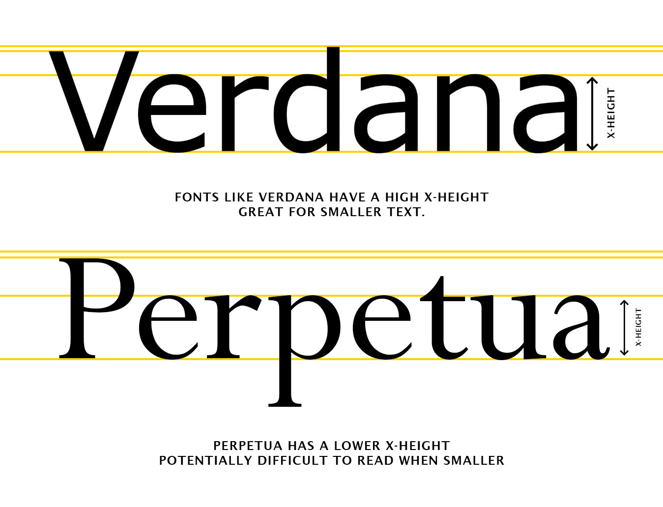
X-Height
The height of lowercase letters (excluding ascenders and descenders).
⭐ Example: Verdana has a high x-height, improving digital readability.
? Common Mistake: Choosing fonts with low x-heights for small text, making them harder to read.
? Pro Tip: Higher x-height fonts work better for mobile interfaces and small print text.
Xerography (Photocopy Art)
A design style using photocopying and distortion to create abstract visuals. Often referred to as Xerox art – after the name of the company that created the fist Photocopier in 1958. Today, the style is often recreated digitally using grunge paper textures and textured fonts.
⭐ Example: Used in punk rock album covers and zine culture.
? Common Mistake: Overusing xerographic effects, making designs too noisy.
? Pro Tip: Blend xerography with modern digital techniques for a polished retro effect – Check out our collection of high-resolution paper textures and rough fonts!

Y-Fold (Brochure Design)
A brochure fold style resembling the letter Y when opened.
⭐ Example: Used in travel guides and promotional handouts.
? Common Mistake: Misaligning fold guides, leading to uneven panels.
? Pro Tip: Use brochure templates in InDesign to align folds properly.
Yellow-Blue Contrast (Color Theory)
A high-contrast complementary color pair, often used for visual impact.
⭐ Example: Van Gogh’s “Starry Night” features striking yellow-blue contrast.
? Common Mistake: Using yellow on white, which reduces readability.
? Pro Tip: Pair yellow with deep blue or black for the best contrast.
Z-Index (CSS & Web Design)
A property that controls the stacking order of elements on a webpage.
⭐ Example: Modals and pop-ups use high Z-index values to appear on top. (a pop-up could use the css class of z-index: 10; while the website content could use z-index: 1;)
? Common Mistake: Overusing high Z-index values, causing UI conflicts.
? Pro Tip: Keep Z-index values minimal and structured for clean design and easier coding. Leave gaps between z-index numbers incase you need to add new layers of elements in the future.
Zebra Striping (Table UI Design)
A design pattern where rows alternate colors for readability.
⭐ Example: Used in data tables, spreadsheets, and web design to improve row visibility.
? Common Mistake: Using too much contrast, making the pattern distracting.
? Pro Tip: Use subtle tints for effective striping. If a contrasting color is preferred, try changing the text color too.
