
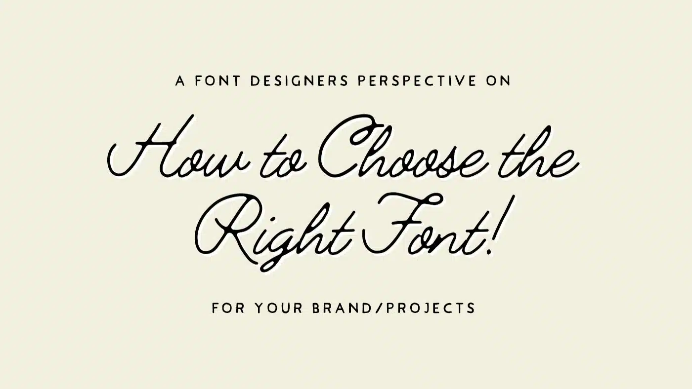
In the flooded markets of today, the significance and potential power of a brand’s visual identity can’t and should not be underestimated. One crucial, and often overlooked, aspect of this identity is typography particularly the selection of the right font.
Handmade fonts, with their unique character and craft, can considerably elevate a brand’s image and in this article, we will dive into the importance of choosing the right font for your brand and provide tips to select the perfect handmade font that resonates with your/your business’ identity.
Understanding the Impact of Font Selection on Brand Identity
Selecting the appropriate font for your brand is an integral part of creating a compelling brand identity. The typography you choose speaks volumes about your brand; it sets the tone for your messaging, infuses character into your visuals, and significantly influences how your audience perceives your brand. Fonts have the power to evoke emotions and conjure up specific associations in people’s minds, contributing to the overall branding strategy.
For instance, serif fonts, with their traditional and strong character, are often chosen by brands that aim to project an image of reliability and authority. On the other hand, sans-serif fonts are typically associated with straightforwardness and simplicity. Handmade fonts provide a unique aesthetic, bringing with them a sense of authenticity, creativity, and individuality to a brand – and they just so happen to be my specialty!

How to Choose the Perfect Handmade Font for Your Brand
Choosing the right handcrafted font for your brand isn’t a task that should be taken lightly. It requires careful consideration of various factors that align with your brand’s values. Here are a few tips to guide you through this process:
1. Understand Your Brand’s Personality:
Starting off by imagining your brand as a real person can make this process a little easier. This person could be traditional, modern, playful, or creative. The font(s) you choose should align with these traits.
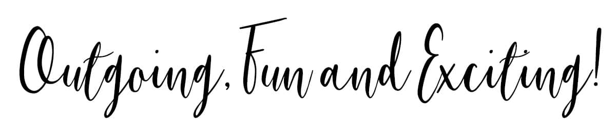
Example 1: Kate is a fun, loving, outgoing person who adores painting. Using a simple san-serif will not do Kate justice, while a bouncy modern-calligraphy font or an expressive brush font could fit the bill perfectly. (Swap ‘Kate’ with a fun brand producing exciting and playful products and you have yourself a solid font choice for a logo design!)
Example 2: Mark is a straight-talking, no-nonsense guy, with a strong love for the environment and its preservation. A clean serif font might come across too formal and corporate, but a hand-drawn serif could be ideal! (Swap ‘Mark’ with an innovative brand using alternative materials to produce eco-friendly products and you have a font that speaks to the heart of your audience)

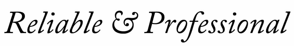
Example 3: Christina is a successful and powerful businesswoman at the top of her field. Everything is planned and perfectly executed. A hand-drawn font would not be the best choice, but a clean italic font with strong serifs could be a great solution. (Swap ‘Christina’ for a law firm with an established history in corporate cases and you have a reliable and trustworthy font moving forward)
2. Consider Your Audience:
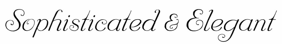
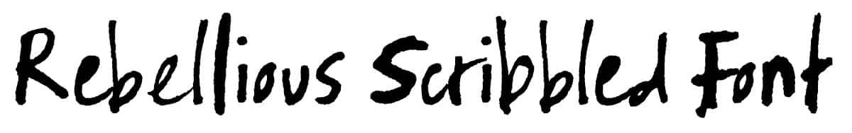
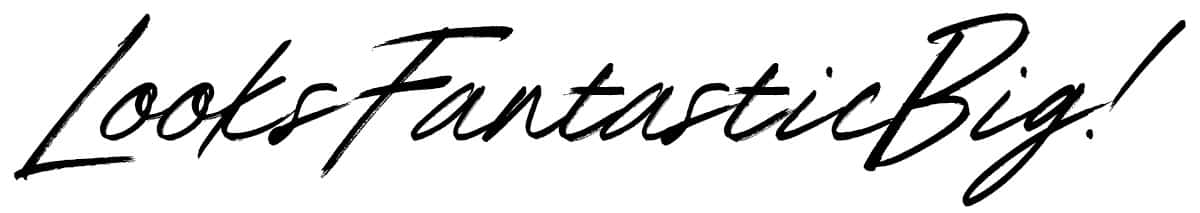
Who are you trying to reach with your messaging? Understanding your audience is step one and absolutely crucial when making any design choice, especially when choosing the right font. A brushed or scribbled font may appeal to a creative, younger demographic, while a sophisticated, elegant handwritten font might resonate more with a mature audience.
3. Evaluate Legibility:
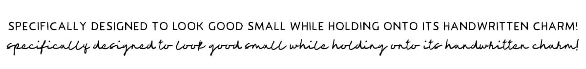
While aesthetics are important, don’t overlook functionality. The font you choose must be easy to read across your selected mediums and sizes. If you’re planning on using very small text, a handwritten font may not be the best choice. That said, there are exceptions – my Jimmy Sans font was designed specifically to look good small!
4. Consistency is Key:
Your chosen font(s) should be consistent across all your brand’s visual elements. It helps to maintain uniformity and reinforces brand recognition.
5. Font Pairing is just as Important!
Okay, you’ve selected your primary font(s). Who are your supporting acts? These ‘secondary’ fonts can elevate or tarnish the impact of your primary choice. I’m not one to stick to rigid rules when it comes to design, but there are some recommendations when it comes to font pairing that will be covered in another article for another day!
In the meantime, trust your instincts and take inspiration from the work of agencies/designers you admire. How are they using different font styles together? Many of my font families contain multiple styles that complement one another beautifully. You don’t need to purchase them to see the fonts working together throughout the presentation images.

6. Test Multiple Fonts:
Lastly, don’t be afraid to experiment with different fonts. Seeing them in context, in various sizes and colors, can give you a better sense of how well they align with the story you’re trying to tell!
In conclusion, the right font selection can significantly enhance your brand’s identity and communication. Handmade fonts, with their unique character, can provide an added layer of authenticity and individuality to your brand’s personality. As you embark on this exciting journey of choosing the perfect font for your brand, remember to align it with your selected values, ensure that it speaks to your target audience, and maintain consistency.
I hope this article provides a starting point in your quest to find the perfect handmade font for your design projects moving forward. Feel free to explore our diverse collection of high-quality handmade fonts – I’m almost certain that you’ll find one that fits like a glove; That said, if you need any advice, comment below!
Excellent article, I see fonts the same as I see graphics, they are just as important & have definite styles, & balance is also important in the pairing. I try and explain this to my website clients who often like inappropriate fonts for their business type – I think I’ll just send them a link to your article ongoing! 🙂