In the ever-evolving design world, textures and patterns are the unsung heroes that can turn ordinary visuals into something memorable. They’re not just about looking pretty; they evoke emotions, communicate brand vibes, and seriously boost user engagement. Whether you’re jazzing up a website, packaging, or print materials, textures and patterns add that extra oomph, bringing depth and dynamism to any project.
This article is your go-to guide on why textures and patterns are a big deal in design, how to use them like a pro, and the tools that’ll help you level up your work.
Textures and patterns are the secret sauce in shaping how people experience and engage with visual content. A well-placed texture can add dimension to flat designs, while patterns offer consistency and flow, creating a more cohesive vibe. They’re not just eye candy; they communicate moods and styles that connect with viewers on a deeper level.
In a digital world full of sleek, minimalistic designs, textures and patterns bring warmth, authenticity, and engagement. From vintage grunge textures to hand printed patterns, knowing how to integrate these elements can elevate your design game and set you apart from the competition.
Understanding Textures vs. Patterns
While they’re often lumped together, textures and patterns serve different purposes in design.
- Textures: Think of textures as the feel of a surface—rough, smooth, or grainy. Digital textures mimic real-world surfaces, making designs feel more tactile and realistic.
- Patterns: Patterns are all about repetition—shapes, lines, or motifs that create order and rhythm. They add visual structure or personality without overwhelming the viewer.
For example, a rough paper texture might be perfect for a rustic or vintage-themed print design, while a grid-based pattern could be ideal for structuring a modern website or publication layout.
Why Textures and Patterns Matter
Textures Add Depth and Realism
Textures let designers simulate real-world materials, making visuals immersive and multi-dimensional. They give a sense of tangibility that resonates with viewers. For instance, using a wood texture can suggest durability and craftsmanship.
Patterns Provide Structure
Patterns bring consistency and help organize elements within a design. Whether used subtly in the background or boldly as the main focus, they contribute to a cohesive visual flow.
Real-World Examples
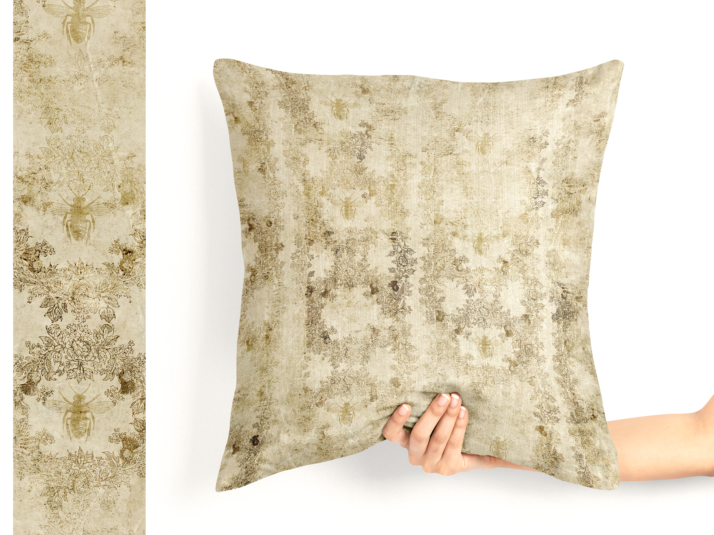
- Print Design: Using rough textures and patterns within the design of a book cover or pillow design can give it an old-world feel that resonates with vintage or artisanal themes.
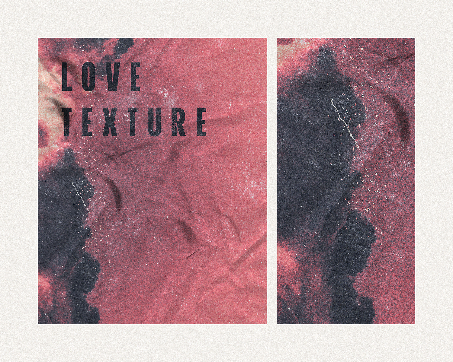
- Digital Design: Gradients, grain, and noise textures are often used in digital artwork to give it a more realistic, hand-crafted look, contrasting sharply with flat digital elements.
Types of Textures in Design
Organic Textures
Natural textures like wood and stone bring an earthy, organic feel to designs. They’re perfect for eco-friendly brands or projects emphasizing sustainability and authenticity.
Fabric and Paper Textures
Fabric textures add warmth and familiarity, while paper textures can evoke everything from vintage nostalgia to modern elegance.
Grain and Noise
These digital techniques achieve a distressed, vintage, or grunge look. Grainy textures work well in photography and branding aiming for a retro aesthetic.
Digital Textures
Using brushes or effects in software like Photoshop or Illustrator, you can create digital textures such as watercolor effects, paintbrush strokes, or metallic finishes to add unique, artistic flair to your projects.
Common Uses of Patterns in Design
Geometric Patterns
Clean lines and shapes make geometric patterns a go-to for minimalist or modern design. They bring order and simplicity, perfect for web layouts or product packaging.

Floral and Abstract Patterns
Floral and abstract designs are popular in fields like fashion and interior design. They’re perfect for evoking eras or styles, like retro or bohemian vibes.
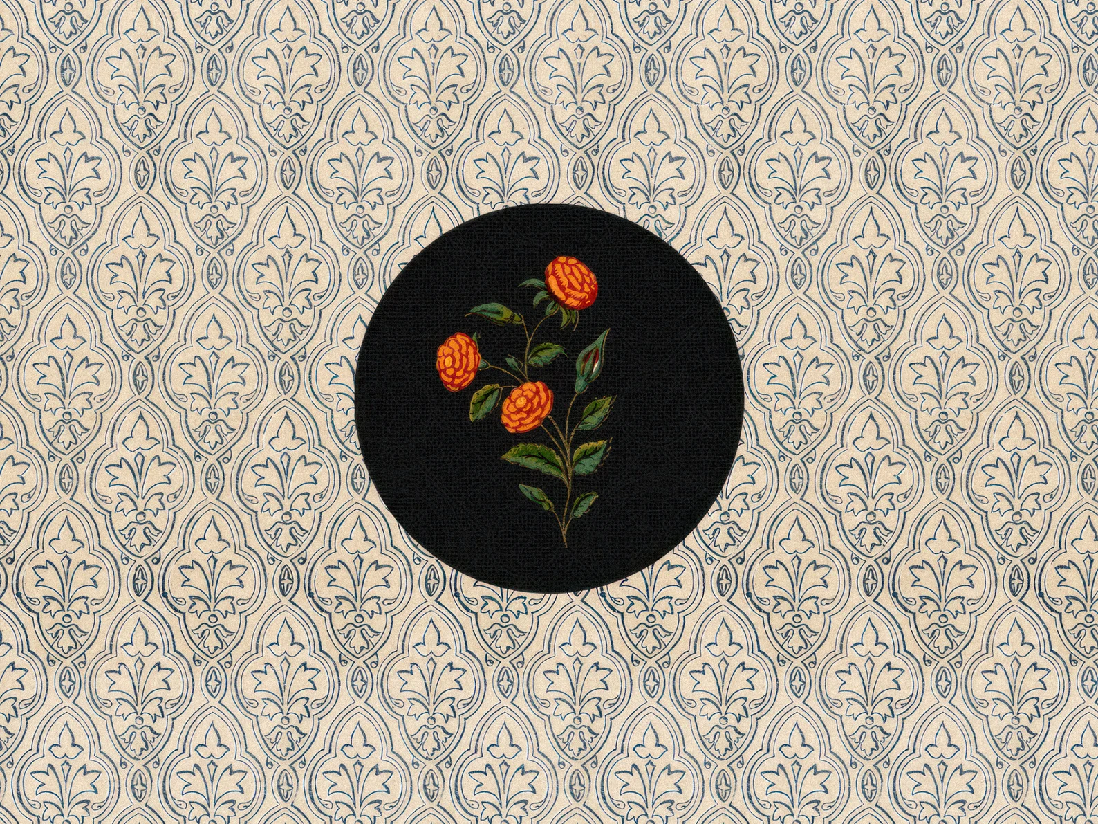
Seamless Patterns
Seamless patterns are essential for structured, professional layouts in websites and publications. They’re great for product catalogues or any design needing a clean, organized appearance.
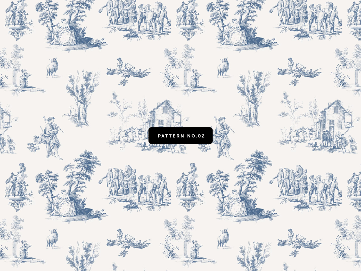
Choosing the Right Textures and Patterns
Matching Textures to Brand Identity
Every texture and pattern has a style that conveys a message. For an eco-friendly brand, textures like wood, paper, or stone may align with your brand identity. Sleek metallic or minimalistic geometric patterns may be a better fit for tech or finance companies.
Choosing Patterns Based on Purpose
When selecting a pattern, think about the design’s purpose. A delicate floral pattern might suit wedding invitations, but a clean, minimal geometric pattern is better for professional reports or corporate presentations.
Color Considerations
How a texture or pattern interacts with the color scheme is crucial. Ensure they complement your palette without making the design too busy.
Advanced Tips for Using Textures and Patterns
Layering Textures for Depth
Layering multiple textures can create a complex, multi-dimensional look. For instance, layering a grain texture over a paper texture gives designs a vintage or distressed feel.

Blending Patterns and Textures
Blending patterns with textures can create stunning results when done right. The key is to avoid overwhelming the viewer—balance is crucial.

Using Solid Colors to Break Up Textures
Designs can become overwhelming with too many textures or patterns. Solid colors help break up these elements, providing visual rest while maintaining a cohesive design.
Best Practices for Optimizing Textures and Patterns in Web Design
File Optimization
While textures and patterns can boost a design’s aesthetic, they can slow down web pages if not optimized. Use compressed formats like SVG or PNG to maintain quality while minimizing file size.
Responsive Design Considerations
Ensure that your patterns and textures look great across all devices. Textures should scale without losing quality, and patterns should remain consistent and seamless, whether viewed on a mobile screen or a large desktop monitor.
Accessibility
High-contrast textures or complex patterns can interfere with readability. Make sure users with visual impairments can still access your content by testing the readability of text over textured backgrounds.
Textures and patterns are invaluable tools in any designer’s toolkit. They don’t just make things look good—they provide a deeper level of engagement, transforming flat or simplistic designs into rich, dynamic compositions. Whether you’re adding realism with organic textures or introducing structure with repeating patterns, mastering their use can dramatically elevate your work. These elements can evoke emotions, communicate brand identity, and influence how viewers interact with a design.
Moreover, strategically incorporating textures and patterns helps distinguish your projects, giving them a unique edge in an oversaturated market. From web design to packaging, the possibilities are endless when you understand how to use these tools to their full potential.
For those looking to enhance their work, Tom Chalky offers a wide selection of high-quality textures and patterns suitable for both personal and commercial projects. Explore their collection to elevate your next creative endeavor.
FAQs
1. What’s the difference between texture and pattern in design?
Textures refer to the tactile or visual feel of a surface, while patterns are repeated elements in a design.
2. How can I choose the best texture for my design?
Consider the mood you wish to convey. Natural textures like wood suit rustic designs, while sleek digital textures work well for modern branding.
3. How do I layer patterns and textures without making the design too busy?
Balance is key—use solid colors to break up patterns and avoid overwhelming the viewer.
4. Can I use free textures for commercial design projects?
Yes, but check the licensing. Some free textures are only for personal use, while others are suitable for commercial work.
5. Where can I find high-quality textures and patterns for my projects?
Check out Tom Chalky’s extensive collection for unique, high-quality design elements.


